Porras — Brand Identity for a Spanish Food Truck
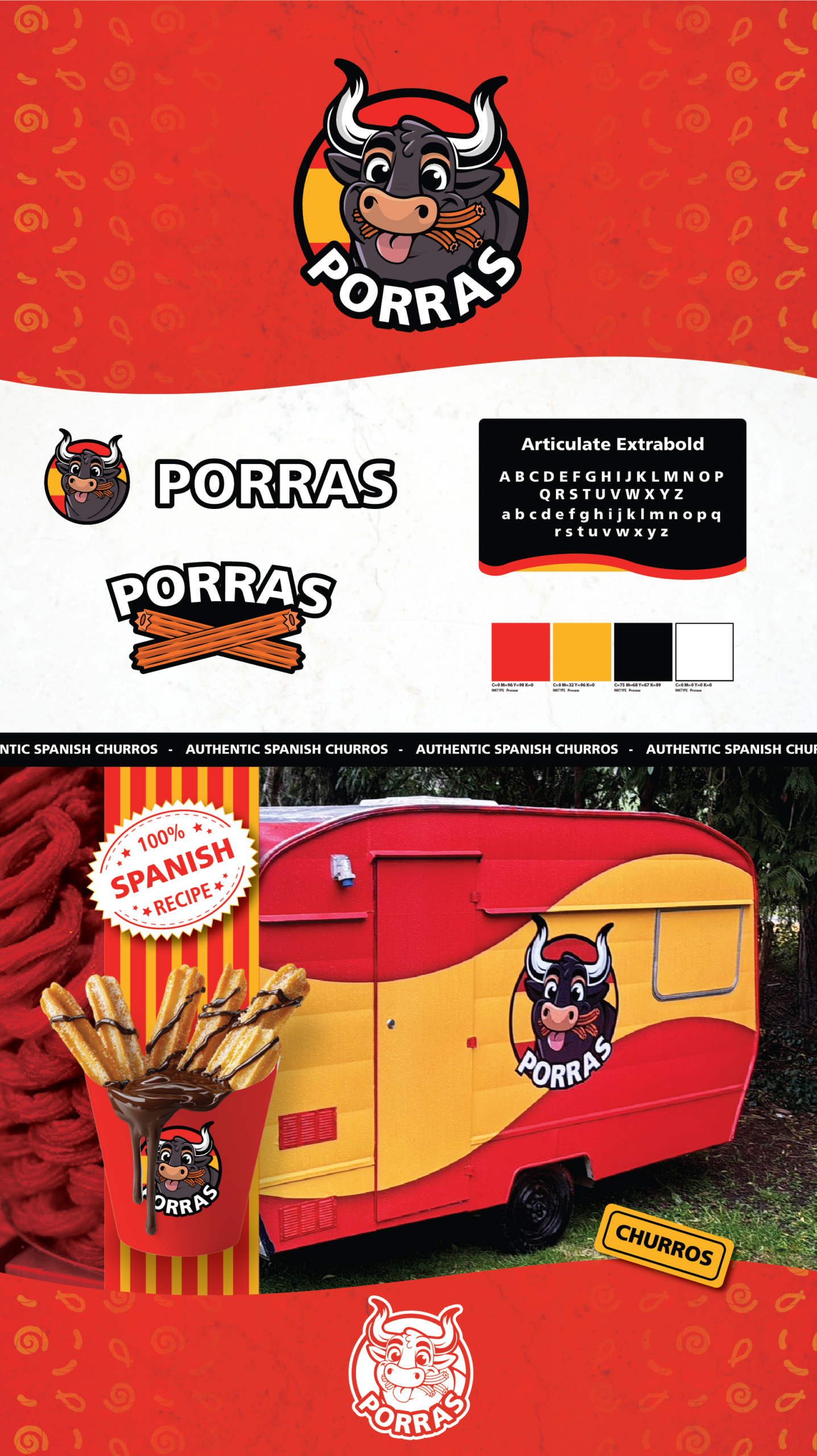
Porras is the visual identity for a Spanish food truck specialising in porras, the thick, traditional churros from Spain. The goal was to create a brand that felt unmistakably Spanish, bold, and full of personality — without leaning into bullfighting imagery or stereotypes that could alienate customers. The colour palette draws directly from the Spanish flag: deep red, warm yellow, and charcoal black.
These colours give the brand a strong national character while still feeling modern and friendly. Red and yellow communicate warmth, energy, and appetite, while black adds contrast and structure, helping the mascot stand out clearly on signage, packaging, and the truck exterior. For the mascot, we chose Spain’s national animal — the bull — but reimagined it in a playful, cartoon‑friendly style. Instead of the aggressive or traditional bullfighting aesthetic, this bull is rounded, expressive, and approachable.
The character was designed to feel welcoming to families and children, with soft shapes, big eyes, and a cheerful expression that communicates joy rather than intimidation. The result is a mascot that celebrates Spanish culture without referencing bullfighting, keeping the brand inclusive and inviting. Overall, the Porras identity blends cultural authenticity with a contemporary, family‑friendly tone. It captures the spirit of Spain — bold, warm, and full of flavour — while presenting a mascot and colour system that feels fun, memorable, and instantly recognisable on the streets of New Zealand.