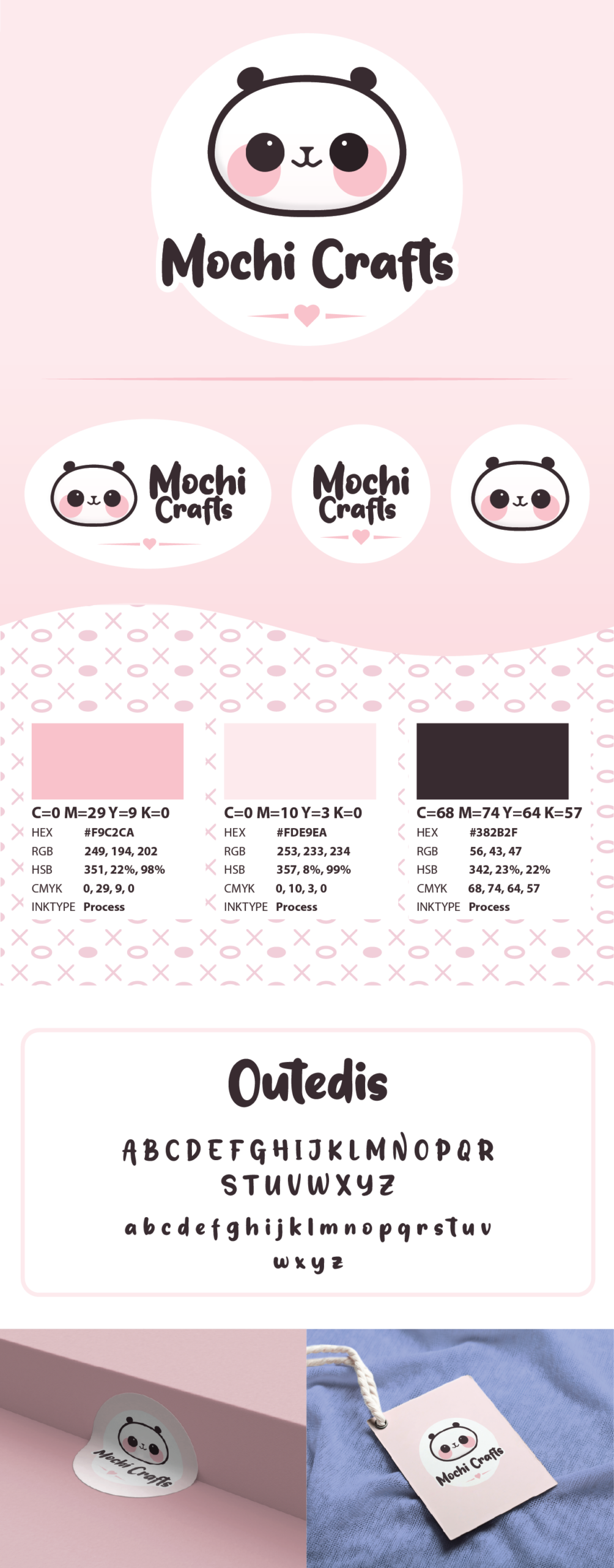
Mochi Craft — Brand Identity for a Crochet & Amigurumi Store
Mochi Craft is a warm, playful brand identity created for a craft store specialising in crochet and knitted amigurumi. The goal was to design a logo that immediately communicates softness, creativity, and the handmade charm of fibre arts. The name “Mochi” evokes something cute, round, and comforting — the same qualities that define the store’s products.
At the heart of the logo is a panda mascot, chosen for its gentle, friendly personality and its natural association with softness and cuddliness. The panda’s rounded shapes and expressive features mirror the look and feel of amigurumi toys, making it instantly relatable to the store’s audience of makers, hobbyists, and gift‑seekers.
The visual language is built around a soft, welcoming colour palette, using gentle pastels and muted tones that reflect the tactile nature of yarn and handmade crafts. These colours help the brand feel approachable and calming, echoing the meditative, joyful experience of crocheting.
A key design element is the background pattern, inspired directly by crochet stitch diagrams. The repeated crosses and circles reference the symbols used in traditional crochet patterns, subtly weaving the craft itself into the brand identity. This pattern adds texture and personality without overwhelming the mascot, creating a cohesive system that works beautifully across packaging, labels, social media, and workshop materials.
Typography is clean, rounded, and friendly, supporting the panda illustration and reinforcing the brand’s soft, handmade aesthetic.
Overall, Mochi Craft’s identity blends cuteness, craft tradition, and modern design into a brand that feels heartfelt, creative, and instantly recognisable — just like the amigurumi toys it represents.