The Celtic Flute — Logo Design for a Pub
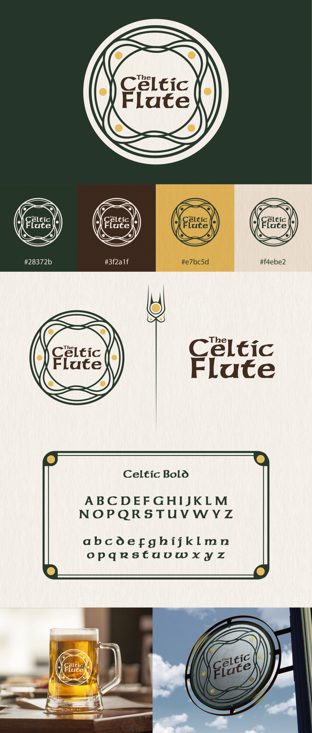
The Celtic Flute is a brand identity created for a pub inspired by Celtic music, folklore, and warm pub culture. The concept centres on the traditional Celtic flute — an instrument known for its soft, haunting tone and its iconic six‑hole structure. Rather than illustrating the flute literally, the logo captures its essence from a front‑facing perspective, reducing the instrument to a clean, circular form with six evenly spaced holes. This creates a symbol that feels both modern and deeply rooted in Celtic tradition.
The circular design reflects the idea of looking directly into the flute’s body, giving the mark a sense of depth and authenticity. It also creates a strong, simple silhouette that works beautifully across signage, coasters, menus, and merchandise. The six holes are not decorative; they are a deliberate nod to the structure of real Celtic flutes, grounding the logo in cultural accuracy.
The colour palette draws from the earthy, atmospheric tones associated with Celtic pubs and folk music — rich woods, warm metals, and deep shadows. These tones help the logo feel timeless and inviting, echoing the ambience of a dimly lit pub filled with music, conversation, and character.
Typography is chosen to complement the circular emblem: clean, balanced, and slightly traditional, without slipping into cliché. The type supports the logo rather than competing with it, allowing the flute symbol to remain the focal point.
Overall, The Celtic Flute identity blends heritage and simplicity, creating a mark that feels authentic, memorable, and perfectly suited to a pub built around music, culture, and community.